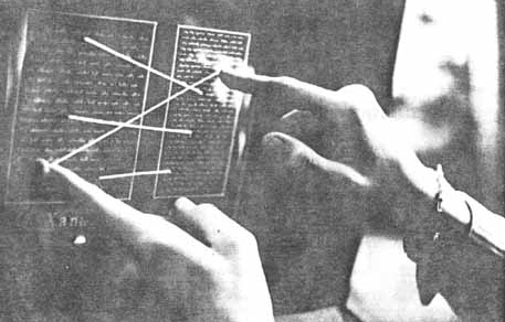
Ever since I’ve been doodling around on apps/tools like Notion1, Tinderbox2 and Roam3, I feel constrained when I look at the flow of text on a regular book.
Of course, it had to be that way in the beginning, because the printed word began with movable type, which had to be laid out in rows, and the page was composed of rows, and so words flowed top to bottom.
But (okay, speaking for myself here) I don’t think like that, and I don’t read like that either. If someone were to track my eye movement on the page of a book, it’s not dissimilar to that of a long-form article in the browser.
I don’t go left-to-right, top-to-bottom, I’m always darting around, going back and forth, summarizing as I go along, judging whether I want to proceed.
It would be interesting to see — while keeping the medium of paper — have a more random layout, perhaps with arrows linking blocks of text … maybe using colors and labels on links …. Just breaking down the wall of text that exists right now into tiny little pieces.
I’d read that.
